 I decided to analyse the film poster of Twilight next. Twilight is part of a very popular and well known franchise, known my millions of people around the world. The characters in the films have grown fond of fans, there are even books written about the romantic and thrilling adventure of the vampires. Vampires are intriguing to audiences as its non-fiction. Its something out of the ordinary that is exciting to all audiences. I thought that this film poster was really effective, especially considering the characters, fonts and colour schemes used.
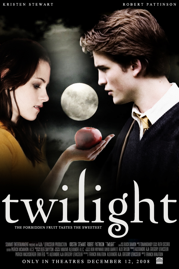
 On the basic structure of the poster, there are two characters;one boy and one girl. The boy is on the right hand side and the girl is on the left. The girl is holding out an apple in the palm of her hand and is starring at it. The boy is looking deep into her eyes, and not even acknowledging the apple that is right beneath his nose. There is a full moon between both of them that is center of the poster which makes it seem significant and dominating. The background is black and smoky which suggests that they are outside in the middle of the night. The title of the film is placed bottom of center in lowercase, white lettering. Above the two characters heads we can see that there real names are put there, above themselves. "Kristen Stewart" is placed above Bella's head, and "Robert Pattinson" is placed above Edwards head. This helps to give fans a direct indication of what actors are going to be shown in the film. If a film has a well known actor in it, then it is going to attract a much wider audience. Robert Pattinson has been in many films, as well as a massive heart throb for many fans out there. This helps give the film a unique selling point and boost the box office hits.
Both the characters appear very pale, much paler than a normal human being. This is probably because they are trying to portray a vampire appearance as they are usually very pale, as they do not breathe. This helps to add a supernatural and thrilling twist to the poster, to help intrigue fans. Their white faces also balances the composition of the poster, as the font at the bottom is also white, as well as the bright moon in the center of the page. The apple in the center of the page, being held by Bella looks significant. Firstly, it is red. The colour red is vibrant and holds connotations with things such as blood and danger which makes it seem alarming. Apples also seem to always have a negative impact, especially in books and films, for example, Snow White, the apple is poisonous, which could suggests a similar circumstance in this film. Bella is not a vampire, which makes her seem vulnerable and innocent, compared to Edward who is represented as as being powerful, strong and independent. The fact that Bella is looking at the apple and Edward is not, makes it seem like she has been lured and tricked into thinking that the apple is good. ( very much like Snow White.)
The colouring of the font against the background is also an interesting angle to depict. The font is white and the background is black, so naturally the colours juxtapose each other, creating a bold and strong contrast so that the font stands out to an extreme level. Black is usually seen to be more negative and the white is seen to be positive, or metaphorically speaking a "Good vs Evil" representation. The colour black holds connotations with death, evil, power and mystery. On the other hand, the colour white, holds connotations with goodness, purity and wealth. The black (evil) is much largely spread than the white colour, which could suggest that the evil is more dominating than the good, which could suggest that a battle or fight may happen in the film. The placement of the two character is also interesting. The poster is taken at a medium shot or two shot, so their posture, body language and facial expressions is able to be noticed. The fact that the two characters are standing opposite to each other, and are also very close suggests that they are very intimate with each other and might be together in the film. Having a romance side in a film as well as hardcore and thrilling fight scenes helps to target a different range of audiences. Romance films are commonly aimed at girls, as they are able to relate to the emotional side of things, whereas boys are more commonly stereotyped to be targeted at the aggressive and violent scenes, as naturally they are seen to be the stronger sex, making them feel competitions between one an other.
Overall, i feel that this poster is really successful, especially in its use of colours. The black and the white work really well together, creating starking contrasts that help to engage the audience. The posture of the two characters in the poster, and the fact that they are close to eachother suggests that they are in a relationship, which helps to intrigue female audiences.
No comments:
Post a Comment