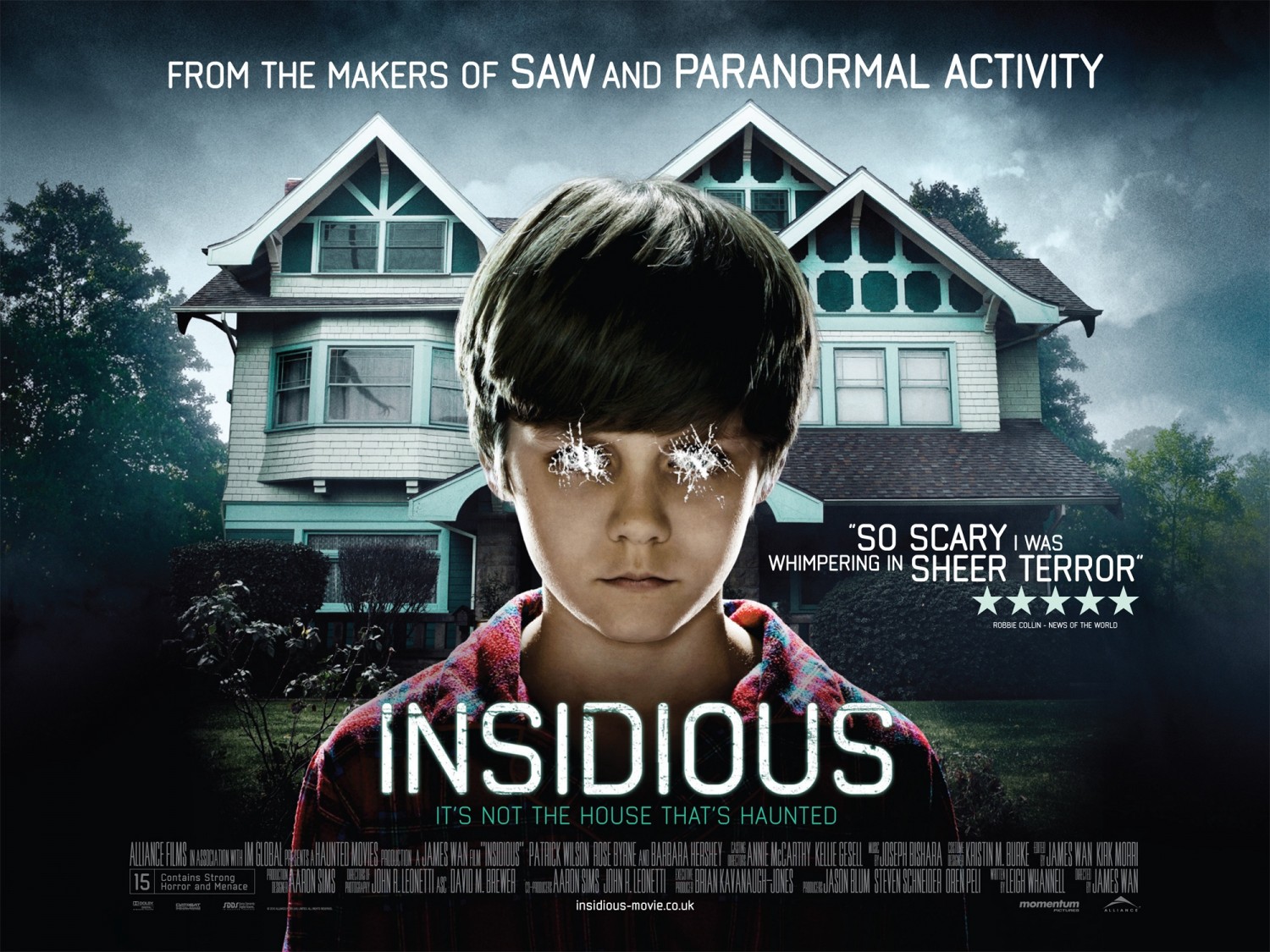
 I decided to analyse a different type of film poster compared to the others that i have analysed. Insidious is a horror film based on a family and a young boy. I thought that this poster projects a different kind of emotion (the emotion of fear) compared to the others that i have looked at. The poster is intriguing as it involves more than just one thing going on, there is a house a boy and the sky shown which makes the poster look more inviting. I was attracted to this poster as unlike most horror posters, this poster is still in light but still manages to be really effective. Although the poster has the presence of a child, it is clear that this film is not directed at a child, due to the titles shown on teh poster reading "So scary it was whispering sheer terror". In addition to this, it also states that it was made from the makers of saw and paranormal activity, which were also extreamly scary and sinister films.
 Onto the basic structure of the film poster, there is a large white house in the background, followed by a young boy in the center of the poster. The title of the film is placed below the boy but also center which makes it seem important and significant. There are trees and greenery on the left and right sides of the poster, and the sky is slightly black with grey undertones which adds a sinister vibe. The house in the background suggests that the film could be based on a family and their son. Usually horror films involve a family, as it makes the film seem genuine and normal, so that when the scary parts come into play, it makes it seem strange and shocking that these events would happen to an ordinary family. Th boys eyes have been scratched, out by what looks like someones nails. This adds a evil and sinister vibe to the poster. It also intrigues the audience as to why this has happened. The boy does not look normal, he appears evil and disturbed or even possessed. Small, little children are a very popular convention expected to be shown in a horror film ever since the release of the Exorcist in 1973. Including the lines "From the makers of" is a very clever selling line as it catches the audiences attention by highlighting other well known films made by the same people. This is a giant help, especially when promoting a new film as audiences are likley to trust producers and viewers of previous films that they have enjoyed watching, and would expect the new film to be of the same standard.The background of the poster is always very significant as it gives the film a setting.
As mentioned, we can see an ordinary home, which is usually a place of security for the characters. If you look closely on the left window there is a silhouette of a demon shown. This gives a preview of what the film is likley to be about. In addition, it also furthers the interest of the audience. The flowers in the background are also dark tones and are dead, which helps to accentuate the sinister vibe. Underneath the title, the strap line states "Its not the house that's haunted.." This is effective as it adds a plot twist to the film before the audience have even had the chance to view the film. The strap line is effective as it gets their mind working, asking questions that can only be answered by watching the film. Having quotes from other sources increases the audiences expectations of the film and convince them to go and see it when its released as it becomes evident that it is worth paying for. The key words such as "scary" and "sheer terror" have been put into a bigger font to make them stand out, thus, catching the audiences attention. In addition to fonts, the title is the boldest and in the biggest lettering, making sure to catch the audiences attention, as its the most crucial part of the poster. Credits are a crucial part of any film poster, as they give recognition to the companies and main names involved in creating the film. They are almost always in the same font , situated at the bottom of the poster. The grey and dark undertones of the background have been a common convention in western countries regarding horror. The tone of the colour accentuates the coldness, death and mystery. This entices the audience, and urges them to find out more, therefore going to watch the film itself.
No comments:
Post a Comment