I decided to analyse the Dark knight film poster, as i feel that the angle that the poster is shot at and the colour schemes are extremely effective in inviting the audience into the action and content of the film itself. The Dark Knight is a very popular and well known franchise, with millions of fans and followers internationally. The film has made huge profits in the box office and has had a worldwide success. Generally, there is a lot going on in the poster, there is flames, the main character and a huge building, so naturally it is going to capture peoples attention. I feel that this poster really represents what an action film is all about. Stereo typically, action films have explosions and is usually based in a city. The fire and flames suggests that there is a lot of hard hitting destruction in the film, which helps to add an exciting plot twist to the audience. The buildings are tall and appear slightly over bearing which adds a dominating feel to the photograph. This also balances the composition of the poster, as Batman's posture also appears slightly dominating.
The poster itself is angled at a low angle. This is an effective way to make Batman appear to be superior and dominating. It also helps to make the buildings in the background appear larger, creating an authoritative atmosphere in the poster. However, in the poster there are also some aspects that challenge the social conventions of action films. For example, the main character or hero is dressed in black which gives off the impression that he is a villain due to the connotations attached with the colour black (evil,power and mystery) His face is also concealed, which suggests that he us hiding something from other people, which could suggests that he is concealing something which adds a mysterious atmosphere to the film. The fire explosion in the background reinforces the stereo typical conventions expected to be seen in an action film. It creates excitement and reinforces the status of an action film. Furthermore, the explosion almost looks like it is in the shape of a person, which would intrigue the audience as to why it is like that, making them want to go and see the film. The background is always an important aspect to consider in a poster. This is because it helps to give an indication to the audience about the setting of the film. The background is dark and cloudy with smoke. This adds atmosphere to the poster as well as suspense. It also links in with the title of the film. The title of the film is placed directly center at the bottom of the page. The middle of anything is where people are usually drawn to first. The title of the film is the most important aspect, therefore it needs to be able to see clearly. To emphasise this, the font is in capital letters and is slightly spaced apart. The font is in white, which contrasts with the black background helping it to stand out and appear bolder. Behind the font, is the Batman logo which is very well known. Having a well known logo on a poster will help to create recognition with the audience. Other Batman related films and merchandise have been extremely popular, which suggests that this film will be of the same standard. Around the Batman logo, there is a white light shining through the perimeter of the bat itself. This again, helps the logo to stand out as the colours juxtapose each other, creating a bolder and more intriguing logo. The main characters posture is also intriguing. He is clenching his fists together, which is what you would do when you're angry, or attempting to harm someone. This adds even more excitement to the film, as aggressive and violent behavior are normal conventions expected to be seen in an action film. They bring excitement to the film and keep the audience on edge. This kind of behavior usually attracts the male gender to the film. Results show that boys relate more to the violent and aggressive scenes due to their physique, masculine ways and hormones.
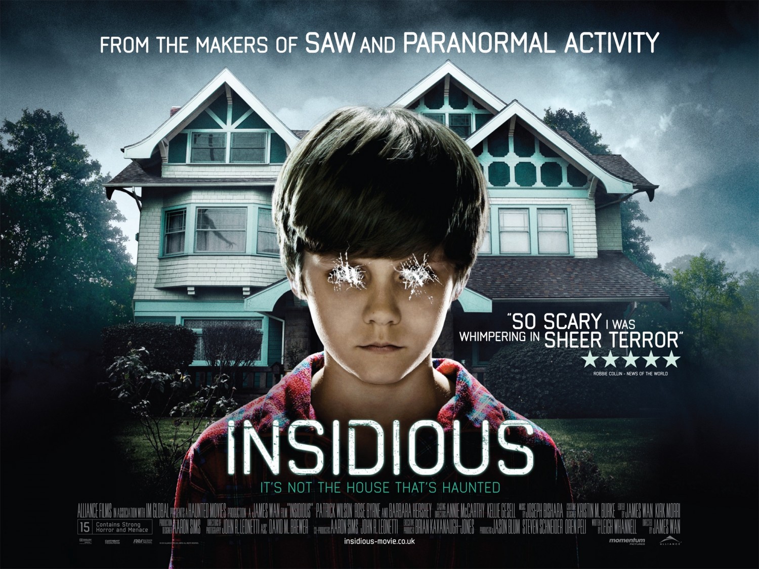
 I decided to analyse a different type of film poster compared to the others that i have analysed. Insidious is a horror film based on a family and a young boy. I thought that this poster projects a different kind of emotion (the emotion of fear) compared to the others that i have looked at. The poster is intriguing as it involves more than just one thing going on, there is a house a boy and the sky shown which makes the poster look more inviting. I was attracted to this poster as unlike most horror posters, this poster is still in light but still manages to be really effective. Although the poster has the presence of a child, it is clear that this film is not directed at a child, due to the titles shown on teh poster reading "So scary it was whispering sheer terror". In addition to this, it also states that it was made from the makers of saw and paranormal activity, which were also extreamly scary and sinister films.
Onto the basic structure of the film poster, there is a large white house in the background, followed by a young boy in the center of the poster. The title of the film is placed below the boy but also center which makes it seem important and significant. There are trees and greenery on the left and right sides of the poster, and the sky is slightly black with grey undertones which adds a sinister vibe. The house in the background suggests that the film could be based on a family and their son. Usually horror films involve a family, as it makes the film seem genuine and normal, so that when the scary parts come into play, it makes it seem strange and shocking that these events would happen to an ordinary family. Th boys eyes have been scratched, out by what looks like someones nails. This adds a evil and sinister vibe to the poster. It also intrigues the audience as to why this has happened. The boy does not look normal, he appears evil and disturbed or even possessed. Small, little children are a very popular convention expected to be shown in a horror film ever since the release of the Exorcist in 1973. Including the lines "From the makers of" is a very clever selling line as it catches the audiences attention by highlighting other well known films made by the same people. This is a giant help, especially when promoting a new film as audiences are likley to trust producers and viewers of previous films that they have enjoyed watching, and would expect the new film to be of the same standard.The background of the poster is always very significant as it gives the film a setting.
As mentioned, we can see an ordinary home, which is usually a place of security for the characters. If you look closely on the left window there is a silhouette of a demon shown. This gives a preview of what the film is likley to be about. In addition, it also furthers the interest of the audience. The flowers in the background are also dark tones and are dead, which helps to accentuate the sinister vibe. Underneath the title, the strap line states "Its not the house that's haunted.." This is effective as it adds a plot twist to the film before the audience have even had the chance to view the film. The strap line is effective as it gets their mind working, asking questions that can only be answered by watching the film. Having quotes from other sources increases the audiences expectations of the film and convince them to go and see it when its released as it becomes evident that it is worth paying for. The key words such as "scary" and "sheer terror" have been put into a bigger font to make them stand out, thus, catching the audiences attention. In addition to fonts, the title is the boldest and in the biggest lettering, making sure to catch the audiences attention, as its the most crucial part of the poster. Credits are a crucial part of any film poster, as they give recognition to the companies and main names involved in creating the film. They are almost always in the same font , situated at the bottom of the poster. The grey and dark undertones of the background have been a common convention in western countries regarding horror. The tone of the colour accentuates the coldness, death and mystery. This entices the audience, and urges them to find out more, therefore going to watch the film itself.
 Insurgent is part of very popular franchise including Divergent, Insurgent, Allegent and Allegent part two. I myself love these films, and have seen them all, excluding Allegent part two as it has not been released yet. The film stars Shailene Woodley and Theo James on their adventures in Chicago city.
Insurgent is a thriller/action movie based around individuals living in a democratic society, whereby each individual belongs to a particular group, or "factions." There are five factions: Abnegation, Erudite, Dauntless, Amity and Candor. Those that do not fit into a faction, are known as divergent's, which are believed to threaten the system and therefore need to be abolished from the organisation. I thought that this film poster was really effective in the sense that the girl appears much more powerful than the male, when subverts the gender stereotypes. I thought that the background was interesting and stood out, i also felt that it was a different poster compared to others that i have looked at, as this poster has more colours and tones which help the poster look more appealing to audiences.
Insurgent is part of very popular franchise including Divergent, Insurgent, Allegent and Allegent part two. I myself love these films, and have seen them all, excluding Allegent part two as it has not been released yet. The film stars Shailene Woodley and Theo James on their adventures in Chicago city.
Insurgent is a thriller/action movie based around individuals living in a democratic society, whereby each individual belongs to a particular group, or "factions." There are five factions: Abnegation, Erudite, Dauntless, Amity and Candor. Those that do not fit into a faction, are known as divergent's, which are believed to threaten the system and therefore need to be abolished from the organisation. I thought that this film poster was really effective in the sense that the girl appears much more powerful than the male, when subverts the gender stereotypes. I thought that the background was interesting and stood out, i also felt that it was a different poster compared to others that i have looked at, as this poster has more colours and tones which help the poster look more appealing to audiences.
The poster generally shows a boy and a girl standing on a small piece of a building. In the background there is a city that looks slightly warned down, almost like it had been involved in some kin of war. This would make audiences intrigued, as it makes them question why the city appears so broken, and if the two characters in the middle are part of it. The sky is a mixture of blues and purples, and we can see the sun shining in the background. The colours of the sky make it look like the poster is trying to look like it was taken at dusk time, or in the late evening, which makes the poster seem unique as most posters are usually in the day or in the night. The cool colours in the sky also add a positive feeling to the poster as they hold connotations with more positive things than negative. Such as, the colour blue connotes happiness, wealth and friendship, and yellow is seen to be related to happiness too as well as beauty. In the sky also, we are able to see that there are birds soaring in the wind. The fact that there is nature shown in the photograph emphasises this positive emotion created by the colours of the sky, as when there is wildlife, it suggests that it is an acceptable environment for them to live in, and therefore safe for humans as well. The background appears like some kind of city, from watching the film i know that it is set in Chicago, however, it is clear from the poster alone, that it is set in some kind of city. Cities are often used in action films as they are a good urban area, with enough space and capacity to put characters into, where they will fit in well. Cities are often busy areas too, which means that they can meet new people as well.
Onto the placement of the characters, there is a male and a female who are both on this part of a building. They are both looking in the same direction, which suggests that they are looking at something important or significant. The audience however cannot see this, which helps persuade them to go and watch the film. One of the main reasons why i chose to look at this poster was because of the placement of the male and the female. Stereo typically in action films, the male is seen to be the most dominant and powerful. However, in this poster, interestingly, the girl is standing up and the guy is leaning downward and looking away from her. When a character is standing above another in one shot, it automatically makes the audience think that they are more significant and therefore more important than the other. The fact that it is a girl standing up makes the idea of patriarchal dominance be stripped away. This would help persuade female audiences to go and see the film, as a female lead in an action film is a fun and unique way to project an action film. Both the characters are wearing black which suggests that they are trying to stay hidden and in a disguise. The colour black holds connotations with power, mystery, death and evil, in which these attachments might be traits that are shown in the characters. We can see that the guy has a gun on his back, which conforms to the conventions of an action film. A gun can kill someone instantaneously with little effort required, therefore it makes the gun dangerous and the person holding the gun dangerous, which makes the guy seem powerful and dominating, even though he is placed in a lower position to the girl. The girl has long blonde hair, which is stereotyped with wealth and beauty, this makes the film also attract male audiences, as having a pretty girl in a film can make males want to go and see the film.
At the top of the poster, the words "Based on the worldwide best seller" is projected. This goes without saying, helps persuade audiences to go and watch the film. If any film or book or piece is a world wide best seller, then identifiably it is clear that it is a successful film. If many others have watched it, then others will follow. It seems clear to put this on a film poster, as it will raise the box office hits of the film itself. The font is very interesting in this film poster. The title of the film is written in capitals, which makes it appear much bolder and intense to the audience. The font is in white, which contrasts with the characters outfits, suggesting that there may be a link between the title of the film and the two characters on the front cover. In the title there is a huge blue slash going through all of the letters. The slash almost looks like a sword or knife has slashed through the word "Divergent" which suggests that there may be a battle between the "Divergent's" and other people.
In conclusion if feel that the background and the posture of the characters in this film poster have been placed together well and makes the film posture look successful. The fact that at the top of the page it says "Based on the worldwide best seller" will help boosts more audiences to go and see the film, thus, raise box office hits.
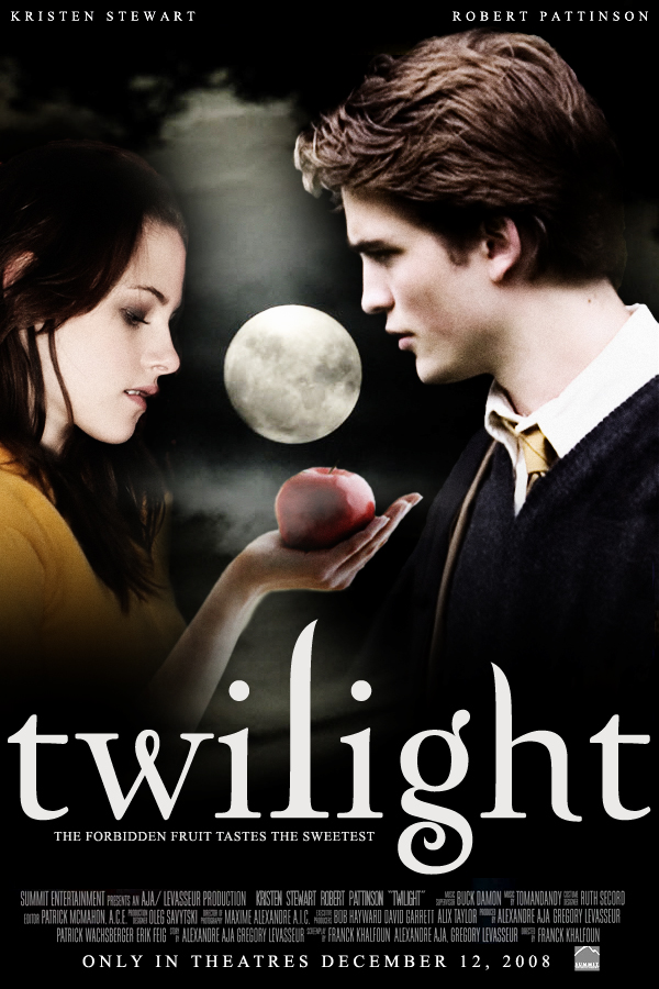
 I decided to analyse the film poster of Twilight next. Twilight is part of a very popular and well known franchise, known my millions of people around the world. The characters in the films have grown fond of fans, there are even books written about the romantic and thrilling adventure of the vampires. Vampires are intriguing to audiences as its non-fiction. Its something out of the ordinary that is exciting to all audiences
.
I thought that this film poster was really effective, especially considering the characters, fonts and colour schemes used.
On the basic structure of the poster, there are two characters;one boy and one girl. The boy is on the right hand side and the girl is on the left. The girl is holding out an apple in the palm of her hand and is starring at it. The boy is looking deep into her eyes, and not even acknowledging the apple that is right beneath his nose. There is a full moon between both of them that is center of the poster which makes it seem significant and dominating. The background is black and smoky which suggests that they are outside in the middle of the night. The title of the film is placed bottom of center in lowercase, white lettering. Above the two characters heads we can see that there real names are put there, above themselves. "Kristen Stewart" is placed above Bella's head, and "Robert Pattinson" is placed above Edwards head. This helps to give fans a direct indication of what actors are going to be shown in the film. If a film has a well known actor in it, then it is going to attract a much wider audience. Robert Pattinson has been in many films, as well as a massive heart throb for many fans out there. This helps give the film a unique selling point and boost the box office hits.
Both the characters appear very pale, much paler than a normal human being. This is probably because they are trying to portray a vampire appearance as they are usually very pale, as they do not breathe. This helps to add a supernatural and thrilling twist to the poster, to help intrigue fans. Their white faces also balances the composition of the poster, as the font at the bottom is also white, as well as the bright moon in the center of the page. The apple in the center of the page, being held by Bella looks significant. Firstly, it is red. The colour red is vibrant and holds connotations with things such as blood and danger which makes it seem alarming. Apples also seem to always have a negative impact, especially in books and films, for example, Snow White, the apple is poisonous, which could suggests a similar circumstance in this film. Bella is not a vampire, which makes her seem vulnerable and innocent, compared to Edward who is represented as as being powerful, strong and independent. The fact that Bella is looking at the apple and Edward is not, makes it seem like she has been lured and tricked into thinking that the apple is good. ( very much like Snow White.)
The colouring of the font against the background is also an interesting angle to depict. The font is white and the background is black, so naturally the colours juxtapose each other, creating a bold and strong contrast so that the font stands out to an extreme level. Black is usually seen to be more negative and the white is seen to be positive, or metaphorically speaking a "Good vs Evil" representation. The colour black holds connotations with death, evil, power and mystery. On the other hand, the colour white, holds connotations with goodness, purity and wealth. The black (evil) is much largely spread than the white colour, which could suggest that the evil is more dominating than the good, which could suggest that a battle or fight may happen in the film. The placement of the two character is also interesting. The poster is taken at a medium shot or two shot, so their posture, body language and facial expressions is able to be noticed. The fact that the two characters are standing opposite to each other, and are also very close suggests that they are very intimate with each other and might be together in the film. Having a romance side in a film as well as hardcore and thrilling fight scenes helps to target a different range of audiences. Romance films are commonly aimed at girls, as they are able to relate to the emotional side of things, whereas boys are more commonly stereotyped to be targeted at the aggressive and violent scenes, as naturally they are seen to be the stronger sex, making them feel competitions between one an other.
Overall, i feel that this poster is really successful, especially in its use of colours. The black and the white work really well together, creating starking contrasts that help to engage the audience. The posture of the two characters in the poster, and the fact that they are close to eachother suggests that they are in a relationship, which helps to intrigue female audiences.
I decided to analyse the film poster from the James Bond franchise- Spectre. James Bond is a very popular and well known franchise that is loved by almost any age group and any gender. Daniel Craig is the star in the movie and is also loved by many fans across the world. Having a well known actor in a film, gives the film a unique selling point. I thought that the poster of the film was very effective, especially in its use of colours and fonts used.
Firstly, i am going to talk about the basic structure of the poster. James Bond is center in the poster, which brings him out more to the audience making himself appear more significant. His arms are folded and his legs are spread slightly apart, making his posture appear powerful and dominating. In his left hand, he is holding a gun that is pointing outwards. Guns are associated with danger and death, which further emphasises his dominating presence. The title of the film is placed bottom center, which is actually very effective. "Spectre" is placed below James, which metaphorically suggests that James is more superior to "Spectre". From watching the film myself, i know that Spectre is the group name of the bad guys in the film, in which James ends up essentially defeating. So, the placement of the font could actually hold deeper connections into the film itself. Below "Spectre" the "007" symbolises placed. This is an iconic symbol that is associated with the James Bond films. Double o seven is his agent number and is known by many fans. As soon as anyone hears the words double o seven it is immediately associated with James Bond. There is a small gun next to the seven at the end. The gun is pointing towards the right, the same as James is in the photograph. This helps to balance out the composition in the photograph. We can see that there is a skull in the background with a hat on. Skulls are human remains, which means that death needs to have taken place for a skull to be there. Thus, skulls are associated with negative things, which gives the poster a mysterious and edgy atmosphere.
The colouring in the poster is also effective. The main colours used in the poster is black and white with hints of dark blue. James is wearing a white suit. Suits are commonly associated with wealth,prestige and authority, which makes James seem significant. He is also wearing a bow tie and a red,velvet hankie in his pocket. His clothing makes him look powerful and accentuate his authoritative nature. The background is black which connotes danger,mystery and power. The fact that the background is larger and more of the poster is black than white suggests that the evil side is more powerful than the good side which also creates a mysterious atmosphere. The black and white together is extreamly effective as they juxtapose/contrast each other really well. They help compliment and help stand each other out. The font used in the poster is capital letters which makes the font appear bolder and more intense. On each point of the letters it looks like there are ridges or sharp points which makes the font seem dangerous and harmful. This could suggest that the content shown in the film is similar to the way in which the font is being presented. The skull is slighted faded in the background and is behind James. This could suggest to the audience that someone is looking over James or that someone is watching him. The fact that it is a skull and not a person suggests that its more likley to be a bad person than good, which brings an ominous vibe to the poster.
In conclusion, i feel that the Spectre poster was really successful especially in its use of colour. The fact that the black and white juxtapose each other helps them to stand out even bolder making the poster look more effective.
 We all decided that we wanted to do an action trailer and divert away from doing a horror or thriller, as we did this kind of thing last year in our opening two minutes. Action films are actually one of the most popular films to the general public, which means that finding a target audience shouldn't be too tricky. Action and crime films are also my favorite genre to watch. I just feel like they truly captivate the audience into exciting and thrilling scenes, helping to keep them on edge and make them feel a part of all the action on screen. One of my favorite action films has to be the James Bond franchise. Analysing all the action trailers help to give me a wider insight and perspective about the type of trailer that we want to create. Although all the trailers are labelled together in one genre, they are actually all very diverse and different, so this means that we will have to think thoroughly about what we want in our trailer.
Looking at the action trailers has also taught me that its important to not show too much in the trailer that will make it too overbearing for out target audience. We want to intrugue them, not throw them off.
Other action trailers have also taught me to have some kind of dramatic climax involved. This is a highly successful way to keep the audience on their toes and feel really involved with the trailer. The trailer is a really important process in the film industry, if the trailer isn't good, then why would anyone want to see the film? Although we are not making an actual film, i still want our trailer to be as realistic and professional-looking as it possibly can be.
Editing is also a key concept when thinking about making an action trailer. The editing, like any trailer, needs to fit the footage and content shown on the screen. For example, if there is a fighting scene ( Which there are a lot of in action films) the editing needs to be quick and fast pace, so that it fits up to the movements made by the characters. This helps to make the audience feel part of the action.
Props in action films are also a fundamental element that needs to be considered. What kind of weapons do we want in our trailer? Guns? Knives?. We will have to think about our plot and how we want our audience to feel. Most modern action films show modern gadgets, such as a pen that is actually a gun, or a mobile phone that is actually a bomb.
Target audience also needs to be thought about. Although 86% of action films are mainly targeted at males, do we want a female lead in our trailer so that we can appeal our film to both genders?
Creating an action trailer allows us to have a wide imagination and create whatever we want. The codes and conventions to action films are pretty versatile, meaning we could add lots of different angles and props that would still fit the genre. Creating an action film will allow us to have fun (especially in the fighting scenes) use props and gadgets and work on new and exciting angles.
I look forward to creating the trailer!
Here is a link to the Bourne Identity trailer: https://www.youtube.com/watch?v=cD-uQreIwEk
I really wanted to analyse the Bourne Identity as it centers a lot around fighting. In all action films, the common stereotype is that there is always some kind of action taking place. When producing our production, we need to incorporate fighting, but obviously without anyone being harmed or hurt. I feel that this film shows the most effective camera angles to perform, and the best way to shoot any fighting scenes. "The story of a man (Matt Damon), salvaged, near death, from the ocean by an Italian fishing boat. When he recuperates, the man suffers from total amnesia, without identity or background... except for a range of extraordinary talents in fighting, linguistic skills and self-defense that speak of a dangerous past. He sets out on a desperate search-assisted by the initially rebellious Marie (Franka Potente) - to discover who he really is, and why he's being lethally pursued by assassins.- IMBD"
 The trailer begins with "Universal" being shown on the screen. Universal is a huge, international company that is the fundamental element of many other successful films. This immediately gives the film a unique selling point, as films produced by a successful provider, helps boost box office hits. We then hear a non diegetic voice, of which is the narrator throughout the trailer. This film was released during 2002, which is quite old considering the of the action films that i have analysed. I wanted to have a range of action films, and not just similar and modern trailers. From watching this trailer, the presence of dialogue helps to inform the audience on a much clearer level. Compared to the modern trailers that i have looked at such as, Batman vs Superman and Suicide Squad, there is no narrator in the trailer, which means that all the clips have to be displayed in a more fluent and clear manner. However, i think having a narrator can some what make the trailer appear slightly tacky and old fashioned, thus, we will not use a narrator during our production. The narrator states "He has the skills of a dangerous man..." The sentence immediately puts the audience into the action of the trailer. As the dialogue is being said, there is a medium shot of an ordinary guy walking through a corridor. This suggests that this is the man that is "dangerous." The guy is wearing a yellow jumper. The colour yellow connotes happiness, which juxtaposes the dialogue being stated by the narrator. The camera then pans next to the man, and he is just walking through a corridor. Then, unexpectedly, he bursts out of nowhere, and starts fighting loads of people. The editing in this part of the trailer is extremely fast paced, which helps make the audience feel part of all the action.
The fast pace editing also accentuates how fast all the actors are "hitting" each other. The main guy is throwing people around, punching people in the face and slinging people onto the floor. It quickly becomes apparent to the audience that he is a very dangerous man, but also clever and intelligent. He also appears more powerful as he managed to beat up six people all on his own. The music here becomes really sped up, and there are drums and a soundtrack being played. Again, the music is fast paced and upbeat, which helps to make the audience feel part of all the action happening on the screen.
Furthermore, the structure of the trailer here is very effective. There is already a lot of action happening just seven seconds into the trailer. This is effective because the audience are thrown right into the deep end of all the action straight away. There is no dramatic climax towards the fighting (apart from when he unexpectedly starts fighting people). I feel that in a way this lets the trailer down primarily because having a dramatic build up can really captivate the audience and make them feel on edge more.
 We then see a medium shot of a guy holding a gun with both of his hands. The use of the gun is effective and is a common convention expected to be seen in an action film. \guns have the power to kill any individual with little effort required. This is what makes them so dangerous and alarming to audiences, as when a character gets shot, it can cause a lot of distress to the characters in the film, and the audience itself. Getting an audience to express and emotion, weather it be fear, anger or being upset, it means that the film is successful as the audience have become attached. The use of the medium shot is effective as the audience are able to see what is in his hands, as well as his facial expressions. His face seems to be slightly shriveled but also dedicated at the same time. We can see that he has his eyes fixed on something, as he doesn't move his head or eyes from one particular spot. This suggests to the audience that he is about to shoot someone which makes them feel on edge and therefore part of the film itself. The screen then jump cuts to another medium shot of the same guy hanging on the roof of a building. We can see that the building is high because the building in the background is really high off the ground. This generates anticipation towards the audience, as he could quite easily fall and damage himself or even worse, kill himself. We can see in the shot that his eyes are fixed on the roof above him, suggesting that he is focusing himself so that he doesn't fall. Regarding the MES, all we can see that he is wearing in a brown jumper and a large silver watch. The watch suggests that he is wise and intelligent, as he is a spy, watches are a simple and yet needed item needed by everyone to tell the time. As this film was made during 2002, i don't think grabbing your iPhone out your pocket is quite the way to tell the time.
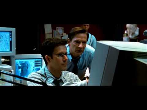
We then see another medium shot of two men looking at a computer screen. In the background of the medium shot, we are able to see other computer screens with maps and targeted points on them. This could suggest to the audience that they are trying to find someone. In action films, having a hunt or a chase to find someone creates anticipation and a thriller nature towards the audience. It makes them feel part of the action, and feel the suspense of the scene. The men in this shot are both wearing suits, which connotes power and authority. There facial expressions in the medium shot are fixed on the computer screen. The guy on the right looks angered and stressed which suggests that he cant find what he is looking for.
In conclusion, i feel like this was a highly successful trailer in the sense that it had a strong variety of camera angles, especially when filming the physical,fighting scenes. I feel like it has had a strong influence for us, when we create our production, especially regarding the camera work.
Here is a link to the Inception trailer: https://www.youtube.com/watch?v=66TuSJo4dZM
Inception is an action movie starring Leonardo DiCaprio as an undercover agent working on a security programme. The trailer includes a lot of stereotypical conventions expected to be shown in action movies, such as the use of modern gadgets, explosions, killings, fighting and fast paced editing. "Dom Cobb is a skilled thief, the absolute best in the dangerous art of extraction, stealing valuable secrets from deep within the subconscious during the dream state, when the mind is at its most vulnerable. Cobb's rare ability has made him a coveted player in this treacherous new world of corporate espionage, but it has also made him an international fugitive and cost him everything he has ever loved"- Warner Bro's pictures.
 The trailer opens with a close up shot of waves crashing together. There is a soundtrack in the background that is the sound of a violin. The use of the violin creates a sinister and uneasy atmosphere, as violins are usually used in horror films to create suspense. We then see a close up shot of a man (Dom) lying down on some kind of hard object in the sea. This adds a mysterious vibe to the trailer, as the audience become intrigued as to why one of the characters is in the middle of the ocean. We then hear non-diegetic dialogue stating "There is one thing you should know about me, i specialise in a very specific type of security."This immediately kicks the trailer off into what kind of genre it it. Security holds connotations with dominance, aggressive natures and power, which makes the audience seem like this character is in a high position in the film. We then see this character outside a lobby near a lift, and he is preparing a gun to shoot. His posture is very lenient, which makes him look like he is sneaking around in the corridor, which conforms to his character of being a spy. It also adds tension to the audience, as it makes them question who is hiding from, and if he does get caught what will happen?. The prop of the gun also adds tension towards the audience. Guns have the power to kill individuals instantaneously, with little effort needed to do so. This is what makes guns so dangerous, but also thrilling and exhilarating in films, as sometimes when a particular character dies in a film, it can tug on the heart strings of the audience, and make them feel part of the film. Dom is wearing a suit when connotes power and authority. This representation is further highlighted through the use of the gun, and his body language. This is all shown through a medium shot, this is an effective shot to use, as the audience are able to see his body language and facial expressions all at one angle.
The editing in the trailer is also highly effective in the way of conforming to the genre of the film. Between each part of footage, a fade to black is used for the transitions. Using the same transitions throughout the trailer helps to create a smooth running trailer, in the sense that the audience are not thrown off, by harsh,brash editing, but rather feel more content as the transitions are all fluent. The colour black connotes power, authority, death and mystery which are all concepts that are presented in action films. However, having slow and smooth editing in an action movie, somehow strips away the aggressive and "action" part of the film. But, this trailer tends to focus more on the spies and gadgets than the violent, aggressive scenes, which makes the trailer seem more mysterious and have an edgy vibe. I myself, have seen the entire film,and i know that there is a lot of violent and aggressive scenes. So not showing all of this in the trailer, doesn't give too much away, which i feel is a huge concept to consider when making a trailer. The worst thing about leaving the cinema is when you feel that all the good parts were played in the trailer, and therefore there wasn't that much exciting content to be shown in the actual film itself. I feel that this trailer will give all of us an influence for our trailer, in the sense that we do not want to film too much. Titles are then projected onto the screen, with a loud thud as each one comes up,creating tension to the audience. Some of the titles read "From the director of the Dark Knight", "From Christopher Nolan". This gives the film a unique selling point, Christopher Nolan has directed all of the Batman movies, which were very successful. The fact that the film has been directed by a very popular and well known director, would help boost the box office hits and make people want to buy the DVD.
 We then see a medium shot of an elderly man talking to a girl. He states diegetically " Mr Cobb has a job offer he would like to place you." The man has glasses, is fairly old and is wearing a suit. Elderly people are stereotyped to be wise,knowledgeable and intelligent, which puts the man in a powerful position in the trailer. The camera then pans towards the girl to which she responds "What? Like a work placement?" The girl has brunette hair, is wearing a floral scarf, jacket and a side bag crossing over her shoulder and front body. She has a bundle of books in her hand, and there are also books in the background on a shelf. Also in the background, we are able to see lots of teenagers moving in different directions. It looks like this location is in a university hall or college like place. This makes her seem innocent and vulnerable. This vulnerability can be further highlighted. After the girl says "Like a work placement?" three fast clips are merged together, which suggests that this is what the work placement would involve. The first clip shows a guy in a yellow taxi, with a gun being waved crazily out the window. The second shot shows two men fighting in a corridor. They are both wearing suits,which suggests that they are powerful men, and finally the last clip shows an establishing shot of a city. All these clips suggest that the work placement is going to be dangerous and at her own risk. As the trailer continues, we hear Dom state non diegeitically "well... this isn't all technically legal..."This statement adds even more suspense to the audience as it suggests that although Dom works in security, what h does for his job goes against the law, and can therefore be dangerous. It also questions to the audience as to weather Dom is the good guy or the bad guy, which i feel is an effective part to put in the trailer, as it leaves the audience on a cliff hanger.

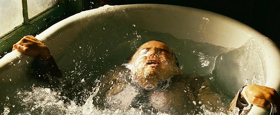
 We then see a medium shot of a guy bursting out of a bath. The brashness of the scene suggests that someone had been holding him under the water, which adds tension to the trailer. This can be further highlighted through the fact that the character is still wearing clothes. Again, the clothing used is a suit, which suggests that this person is in a powerful position in the trailer. Having aggressive and violent scenes in the trailer helps to conform to the conventions of an action film. It lifts the audience out of their seats helping them to feel part of all the action taking place. The screen then fades to black, and we see a close up shot of a man reversing his car. He has one hand on the steering wheel, and the other on the back of his seat. Through the close up shot, the audience are able to see his facial expressions. His face appears shriveled and compressed together, which suggests the emotion of anger. This could further highlight that he might be trying to run someone over or hit something which adds even more suspense.
Here is a link to the Mad Max Trailer: https://www.youtube.com/watch?v=hEJnMQG9ev8
Mad Max is an Australian dystopian action film directed by George Miller, produced by Byron Kennedy, and starring Mel Gibson as "Mad" Max Rockatansky, Joanne Samuel, Hugh Keays-Byrne, Steve Bisley, Tim Burns, and Roger Ward. This film has a high amount of conventions expected to be in an action film, which will pay a huge influence for when we are creating our own production. There is a lot of car explosions, fighting, killing and car chases which all contribute to a heavy and intense action film to keep the audience engaged and captivated into the trailer.
The trailer opens with a medium shot of a guy slamming two heavy, metal doors open. He is running away from something that is behind him. However, as the camera is behind him, it also looks like he is running away from the audience, which helps make them feel part of all the action. As the doors slam open, there is a loud "thud" sound effect placed in the trailer. This is also the first sound that the audience here, so it's likley to make them jump. ( It made me jump) This engages the audience even more, as being fearful, can actually be intriguing. We then see him continuing to run away, as the camera is panning behind him. The camera then circulates around the man. This is effective as we are able to see what he looks like as well as the location that he is in. He is wearing normal trousers with a dirty brown top. He has rope/string wrapped around his head to secure his mouth, which stops him from being able to talk. His hands are also chained together in handcuffs. This gives the audience an indication that he had been captured and imprisoned and is now trying to escape. The lighting in this location is dark and low key. This makes the scene seem mysterious and have an ominous atmosphere, which engages the audience even more. It looks like they are underground, due to the brick like walls and dark wholes and edges around the room. We then see around six men chasing the prisoner which is a stereotypical convention expected to be seen in an action movie. Chases create anticipation which helps the audience feel on edge which in conclusion makes them feel a part of the film. The people that he is being chased by appear weird and unusual. They have white faces with no tops on and trousers. They almost appear alien like which adds a unique twist to the film. It makes them seem out of the ordinary, so that the audience can see something different rather than ordinary humans all the time. The music here is very up-beat and fast paced, so it corresponds with the footage shown on screen, which further intrigues the audience. We then hear a non diegetic voice stating "In this wasteland, i am the one who runs from both the living and the dead." This voice is very sinister and deep,so deep that it actually echoes. The echoing also further highlights the idea that they are underground which means that they cannot be seen creating a mysterious vibe. The word "Wasteland" is used, which suggests that they are living in an distopian place, where there is no people or life about. The chase around the tunnels continues, as the prisoner jumps over cars and around sharp corners as these people attempt to catch him. The editing is extremely effective here. The editing is really fast paced, which makes the chase seem really over the top and intense. The editing gets so fast of all the turns that the prisoner is making, that it becomes blurry to the audience. The voice then stops, and the screen fades to black. When a screen fades to black in a film, the audience cannot see anything, which adds even more suspense and anticipation to the trailer. Then we wear another sound effect of a "Thud" and two doors open again. This shows almost a story line, as this happened at the very beginning of the trailer as well. It almost suggests that there is no way out, and that it is almost like a maze or labyrinth. However, once the two doors open, the prisoner is shocked to see that he is extremely up high, and when he walks out, he is standing on the top of an extremely high cliff. This adds even more suspense to the audience as he is so far from the ground. 


 I really enjoyed analysing Mad Max as if feel that is showed a more diverse perspective of action films compared to Fast and Furious for example. This is because it has abnormal looking people and weapons that show a unique style to the trailer.
The prisoner notices that the soldiers are still chasing, thus he has to make a quick decision of weather to jump or be captured. There is a large hook hanging from a rope just in front of the prisoner. He decided to jump and is now hanging from a random rope in the middle of no where. The long shot allows the audience to see the location of where the film is set. Although having said that, there isn't much to comment on. The location seems like some kind of dessert, as there is no greenery, people or buildings, just sand and land for miles. This creates the idea of mystery, as its clear that there are weird people there as he has just been running from them. The fact that the prisoner is jumping out from such a height creates suspense and anticipation towards the audience. It makes them think "Will he survive?" This thought is actually kind of ironic, because as the prisoner jumps towards the hook, the screen fades to black (again creating suspense) we hear the deep, echoed voice state "Survive", which again creates a link between life and death.
We then see close up shots of various people shooting guns. Weapons and gadgets are also another convention expected to be seen in action films as they have the potential to kill really easily. In this close up shot, the gun is covering the individuals face,meaning we cannot work out their facial expressions or how they are being presented. This adds a mysterious and edgy vibe towards the audience. We then hear the same deep voice say aggressively "THIS IS MY LAND!" This cements the idea of territory. Territory if often a reason for fighting and battles in films, as when people try to take over something that is not theirs, it often triggers wars, (which we guess is the reasoning for the guy escaping.) We then see a close up shot of a very scary and unappealing person/thing. It has blonde hair which is long, and the skin is dirty with brown patches around the forehead. The eyebrows are not visible, but there are black patches around the upper eye area. There is a large lower mask which consists of very large teeth, and two tusk looking things. This abnormal looking creature appears slightly terrifying and something you wouldn't want to mess with. The individual then speaks saying again "THIS IS MY LAND" in which it now becomes apparent to the audience that this is the person that was talking previously in the trailer. The voice now makes sense to the audience, as having a large lower mask, would definitely adjust the way that you're speaking... Having a scary and abnormal creature in an action film helps to keep the audience engaged as it adds a sense of diversity to the film. In the background of the medium shot we are able to see two men. One of the men is shirtless with a large weapon on the front, and what looks like a weapon on his back as well. This adds even more anticipation to the audience. We then see a long shot of two cars out in the sandy dessert. The cars look extreamly different to an ordinary vehicle. They are covered in spikes and tall spears on the back of them. They are a dusty brown colour which adds a negative vibe to the scene. The long shot allows the audience to examine the cars and the people all at one perspective which makes them understand the shot on an easier level, as there is no fast paced editing in this part of the trailer.
I really enjoyed analysing Mad Max as if feel that is showed a more diverse perspective of action films compared to Fast and Furious for example. This is because it has abnormal looking people and weapons that show a unique style to the trailer.
The prisoner notices that the soldiers are still chasing, thus he has to make a quick decision of weather to jump or be captured. There is a large hook hanging from a rope just in front of the prisoner. He decided to jump and is now hanging from a random rope in the middle of no where. The long shot allows the audience to see the location of where the film is set. Although having said that, there isn't much to comment on. The location seems like some kind of dessert, as there is no greenery, people or buildings, just sand and land for miles. This creates the idea of mystery, as its clear that there are weird people there as he has just been running from them. The fact that the prisoner is jumping out from such a height creates suspense and anticipation towards the audience. It makes them think "Will he survive?" This thought is actually kind of ironic, because as the prisoner jumps towards the hook, the screen fades to black (again creating suspense) we hear the deep, echoed voice state "Survive", which again creates a link between life and death.
We then see close up shots of various people shooting guns. Weapons and gadgets are also another convention expected to be seen in action films as they have the potential to kill really easily. In this close up shot, the gun is covering the individuals face,meaning we cannot work out their facial expressions or how they are being presented. This adds a mysterious and edgy vibe towards the audience. We then hear the same deep voice say aggressively "THIS IS MY LAND!" This cements the idea of territory. Territory if often a reason for fighting and battles in films, as when people try to take over something that is not theirs, it often triggers wars, (which we guess is the reasoning for the guy escaping.) We then see a close up shot of a very scary and unappealing person/thing. It has blonde hair which is long, and the skin is dirty with brown patches around the forehead. The eyebrows are not visible, but there are black patches around the upper eye area. There is a large lower mask which consists of very large teeth, and two tusk looking things. This abnormal looking creature appears slightly terrifying and something you wouldn't want to mess with. The individual then speaks saying again "THIS IS MY LAND" in which it now becomes apparent to the audience that this is the person that was talking previously in the trailer. The voice now makes sense to the audience, as having a large lower mask, would definitely adjust the way that you're speaking... Having a scary and abnormal creature in an action film helps to keep the audience engaged as it adds a sense of diversity to the film. In the background of the medium shot we are able to see two men. One of the men is shirtless with a large weapon on the front, and what looks like a weapon on his back as well. This adds even more anticipation to the audience. We then see a long shot of two cars out in the sandy dessert. The cars look extreamly different to an ordinary vehicle. They are covered in spikes and tall spears on the back of them. They are a dusty brown colour which adds a negative vibe to the scene. The long shot allows the audience to examine the cars and the people all at one perspective which makes them understand the shot on an easier level, as there is no fast paced editing in this part of the trailer.
We then see a birds eye view of the guy inside a prison cell. The birds eye view is effective as it makes the cell and the individual seem much smaller. When people in films are seen on a much smaller scale, it makes them seem inferior and subservient which makes the audience sympathise with him. On the editing side of things, this character is given prevalence which also emphasises the sympathy that the audience feel towards him. We then see two guys fighting. The camera is panning around them at a 180 degree angle, which is effective as the audience are able to see a the full picture of all the action that is taking place. The fighting is aggressive and violent, with punches being thrown here and there, and knives and sharp objects trying to be pierced into one another. This aggressive nature conforms to the conventions of an action film. Action films are supposed to have violent scenes in them as it keeps them on edge and involved in the film. Towards the end of the trailer we see a close up shot of the prisoner looking at the camera. This is effective as it makes the audience seem like he is looking at them-again making them feel part of the film. The screen then dips to black and the credits are shown on the screen. I feel that the ending of the trailer is really effective and involves lots of techniques that we could use during the process of our trailer. I feel that having a character look directly into the camera helps to interact with the audience. Good trailer are trailers that the audience can feel a part of, and i feel that this film does it well.
Here is a link to the Fast and Furious trailer: https://www.youtube.com/watch?v=Skpu5HaVkOc
Fast and Furious is an action film consisting of a group of friends that centers around illegal car racing in streets and roads across America. I thought that analysing this trailer would hep us during the production of making our trailer, as the camera work and editing is really strong in this trailer. It shows an adequate amount of footage, but not too much to give the entire trailer away. I feel that the fast and furious trailer is very different compared to other trailers that i have analysed, in the sense that this trailer shows more of one scene, rather than clips from across the entire movie.
 The trailer begins with the institution bursting onto the screen, which is Universal. This immediately gives the film a unique selling point. Universal studios is an international company, and is owned by Comcast through its wholly owned subsidiary NBC Universal. The company makes a lot of money in the film industry, which already gives the movie a head start. We then see a medium shot of a man in a car. He is wearing a black top, with logos on it, and is talking through a walkie-talkie stating diegetically "alright, let's get to work." This dialogue immediately gets the audience involved into the trailer. The sentence suggests that himself and some others are about to do something, inwhich the audience do not know what, which helps to create suspense. The camera then fades to another mediums shot of a girl with black hair, she smiles towards the left, which suggests that she is agreeing with what the other man was saying. She too, is in a car, which subverts to the stereotype of women in films, as they are seen to be feminine and cars are commonly associated with the male gender. The soundtrack in the background is fast paced and upbeat. As the camera moves between each character, the music rises slightly, which adds anticipation to the audience. The music suggests that something exciting or dangerous is about to happen. This is further emphasised through the next character. Through a jump cut, we are presented with another character, a male, tapping his hands repeatedly on the steering wheel of his car. This suggests that he may be feeling nervous and on edge about what everyone is about to do. His walkie talkie then goes off, and a male voice states "Hey, are you freaking out?!" to which he replies "No." Through his uneasy posture and nervous body language and facial expressions, its clear to the audience that he is being sarcastic that he isn't nervous, which adds an even more thrilling vibe to the trailer as its building up to the audience what is about to happen. The music then cuts out, and the screen fades to black. This then adds anticipation towards the audience as they are unable to see or hear anything, and they know that a one of the characters is "freaking out". We then see a medium shot of four modern looking cars all in what looks like a normal room. Until, the camera then zooms out, the audience are then quick to realise that they are in fact on the back of a large aeroplane, up in the sky. This courageous and unexpected scene conforms to the action genre. Having five to six cars up in the sky, and what seems like they are about to jump out, is a scary and terrifying act, which helps put the audience on edge. We then hear a non-diegetic sound bridge of the sound of a heart beating. This suggests that the characters are nervous and apprehensive for what they are going to do. It also helps show a connection between the audience and the characters, as they too would be feeling the same, as they have been captivated by the sound and camerawork already. Through a fade, the audience are presented with a low angle shot of a car falling from a plane. The plane is in the background and appears a lot smaller compared to the car, which suggests that the car is falling quickly through the sky. The car is black and red, which connotes danger and violence, which corresponds with the action present on the screen. The sky is blue with no clouds, which could suggest that they are in a hot and summery location which adds a positive vibe. The car has two large tires on the front back, but rather than them being underneath (like normal vehicles) they are actually on the back window. This makes the car appear much more diverse compared to normal cars, which adds a fun and unique twist to the film. It also conforms to the convention of action films, as they usually contain weird and powerful cars that are used in chases and getaways. We then see the cars racing altogether on a road which looks like a mountain. The camera shows a quick snippet of each character, and they all seem to have their eyes transfixed on a particular point. The camera then pans to the left, and we can then see that there is a large, black coach looking vehicle. All the windows are blacked out which adds the idea of mystery to the coach. The coach then removes its sides, and five guns are released and then start shooting at the characters in their cars. It becomes quickly apparent to the audience that this coach is more bad than it is good, and that it is causing harm and danger to the characters. This is all happening just 55 seconds into the trailer, which means that the audience and thrown right into the action straight away. This means that they are able to feel a part of all the action of the trailer straight away, before their minds are distracted on the less exciting parts of the trailer.
 The camera is quickly jump cutting between each character, as they too fire bullets from their cars and heavy machinery. The use of the fast paced editing and camerawork, makes the scene seem thrilling and exciting to the audience. It makes them feel engaged and captivated by all the action, and feel like they are there too. I feel that having the audience really engaged with the trailer is a highly successful way to make them go and watch the film. If they cannot keep their eyes off the screen, then whats stopping them going to watch the film? I feel that when we are shooting our trailer, we want to be able to make each scene as interesting and captivating as possible, in aid of getting a wider audience for our film. We see a medium shot of the coach in the center of the track, and three of the goodies cars behind it. The coach looks mysterious as the entire thing is blacked out which puts the audience on edge. There is lots of greenery around, which puts a satisfying and relaxing mood on the scene, which juxtaposes the shooting and aggressive nature shown between the vehicles. The shooting continues, and one of the members from the cars gets out and jumps onto the coach. Jumping onto high and dangerous cars makes the audience feel on edge as this is a very courageous act to do. It successfully highlights the thrills and anticipation that is expected to be demonstrated in an action film.
Here is a link to the Batman vs Superman trailer: https://www.youtube.com/watch?v=eX_iASz1Si8
For our trailer, we concluded that we wanted to go with an action movie. Action movies have a very versatile approach, where we can all incorporate different kinds of props, characters, clothing and a lot of exciting and thrilling scenes. With our opening two minutes from last year, we went with a thriller, which has many similarities to an action, which helps to give us a head start with out selected genre. I wanted to analyse the new Batman vs Superman film, as i feel the camera work and use of CGI will be extremely helpful during the filming of our trailer.

The trailer begins with an establishing shot of a skyline of a city. It is night time in the shot, so there is a minimal amount that we can see on the screen. There is no soundtrack at this moment, however there is a rocket/aeroplane typed object that is soaring in the sky. It has a large surface area, and appears powerful and dominating. As the rocket soars across the sky, the camera pans around it, making the audience feel part of the action. It also allows the audience to see what exactly the aeroplane is, to help introduce the idea of modern technology into the film. Through a fade to black, the audience are presented with two people inside of the rocket. The gentlemen is old and is wearing glasses and a jumper with padding on the shoulder. Through an over the shoulder shot, we can see that this gentlemen is actually controlling the aircraft. This conforms to the stereotype of elderly people being wise and knowledgeable, as this aircraft appears highly difficult to control throughout the sky. We are then introduced to one of the main characters in the entire trailer. The elderly gentlemen states diegetically "Why don't i drop you off on the second?" The air craft then halts, and the camera zooms out to a wide angle. We then see Batman jump out of the aircraft and onto the front. Batman is all in black ( hence bats). The colour black connotes danger, wealth,power and death, which puts him in a superior position in the trailer, and almost appear slightly heroic. Through a medium shot, Batman then jumps through a glass building into a room. We hear the sound effect of glass being shattered which conforms to an action movie. It adds excitement and a thrilling atmosphere to the audience, as pushing your whole body through a glass ceiling isn't an every day act that any normal human being can do. The audience can then hear a a thud, and then a fade to black. This creates suspense to the audience as it makes them question what is going to happen next. The thud is loud and pounding, almost like a gun shot. The fact that the editing then fades to a black screen, it means that the audience are unable to see what is going on, which adds even more suspense to the scene. The black screen then fades, and we are presenting with a camera pan of many men holding heavy guns all pointing at the same area. The audience are unable to see what the men are pointing at which adds a greater deal of suspense as it must be something powerful due to the sheer volume of guns being pointed. There is then a huge thud, and Batman storms through the middle of all the men armed with guns. All the men are pushed backwards due to his powerful entrance into the room. This reinforces Batman's powerful presence and Ora, and puts him in a protagonist position in the trailer. After Batman has stormed into the room, the audience are then presented with the main action in the trailer. Batman and all these men start fighting. The fighting is aggressive and violent, with men being slung into the wall, to bones being crushed and shattered by Batman himself. Again, Batman's power fullness is accentuated here, as he has beaten all these men just on his own. The use of sound effects here is effective in adding an action vibe to the trailer. The use of thuds, bangs, screams and screeches helps to make the audience feel scared and captivated by all the action. Action feels are usually aimed a male audience, due to the sheer amount of violence and boystrous behavior presented in action films. We are then presented with an over the shoulder/long shot of a dark figure standing up, a large building in the background and superman being on the floor in the background. When a character is standing over another character it makes them seem more powerful and dominating. It makes the audience feel more connected to that character due to their powerful position in the film. The weather in the scene is raining, which could also bring in the idea of pathetic fallacy ( weather effecting the mood). Raining is commonly seen more negatively, which suggests that the scene is going to go more downhill than up.... The screen then fades to black again, which seems to be a regular occurrence in the trailer, which helps to make the trailer flow. We then hear a non-diegetic, deep voice say "He has the power to wipe out the entire human race..." This is a very alarming sentence and will help to make the audience feel on edge and captivated into the film. We then hear a thud, and a clip of Superman turning around in slow motion. The use of the slow motion is effective, as it makes the audience more fixed onto the action in the film. It makes them feel like they are part of the movie, and get a sense of what it would be like to be in that characters shoes.
 We then see a car chase which is a common convention that is expected to be seen in an action movie. The car chase corresponds with the soundtrack played over the top. The soundtrack is upbeat, with a drum and a rhythmic tune being played. A drum adds an aggressive vibe to the trailer and the tune is fast-paced which corresponds with the speed of the cars. The cars in the chase are sports cars and are both black. They are sleek looking, with bright lights,large tires and a large engine (By the sounds of it). Car chases add excitement to the audience as it brings the idea of "Who's going to win?" typed scenario to trailer, which again, adds suspense. The screen then jump cuts to titles stating "THIS YEAR" which gives the audience an indication of when the film is going to be released. Batman and Superman are both very well known characters, and the fact that they are now in a film together, already gives the film a unique selling point. The film is also part of a franchise, which helps to manage the expectations of the fans. We then see a long shot of a tunnel, with three armed soldiers on either side. At the end of the tunnel in the middle of the sides of soldiers, we can see Superman. The lighting in the tunnel is low key, which adds a mysterious vibe to the scene. However, there is more light being projected onto Superman which helps to make him seem more important. The soldier's on either side almost look like they are bowing towards Superman which makes him seem dominating. Around the borders of the frame, it is dark, which almost makes it look like an eye, which suggests that someone or something is watching them. The use of a tunnel in the scene is effective, as there is never many people in a tunnel setting, which sets the idea of secrecy and mystery to the audience.

 We then see a long shot of Superman lifting up a heavy weapon/aeroplane typed object. The object is almost ten times the size of Superman which makes him seem really strong and dominating. He is wearing his signature costume , consisting of the blue one piece, and a red cape. The colour red can symbolsises power and royalty, which are connotations that the audience are expected to relate to superman. The background of this shot is slightly unclear, as there is a lot of smoke and fire. The use of fire and explosions in actions films brings excitement to the audience. The music here becomes silent as Superman is holding the extremely large object which makes the audience feel suspense as its almost like something is about to happen once the music returns to the trailer. We then see a medium/three shot of Batman, Superman and a girl in the middle. The girl appears powerful, as she wears a shield and sword, which subverts to the stereotype of women,as they are seen as the weaker sex between males and females. She has a headpiece on her head, which adds a unique twist to her character. In the background of the shot, there is flames and fire which makes the scene seem dangerous but also slightly exciting. Batman and the girl are armed, which suggests that a fight or battle is about to begin. This is happening towards the end of trailer, which makes the audience be on a cliff hanger, which engages them and also persuades them to watch the film when it is released.
I really enjoyed analysing this trailer. As it was released this year it means that many people are already interested in the film, which makes it easier to write about. Superman and Batman are both well known, popular characters int he non fiction world, which makes the trailer even more exciting to write about.