Monday 30 January 2017

Main Film Poster Inspiration

Image result for clown film posterFor our film poster we took our main inspiration from the film 'INSANE'. This particular poster had many features that made us take a lot of inspiration and ideas. The genre of this film is the same as our trailer ( a clown horror ) therefore, the poster had a lot of stereotypical conventions linking to this particular genre. The film poster is very similar to the trailer in a way. In the sense that, the film poster and the trailer need to give the audience an idea to what the film is about, without giving too much away. We want to engage our audience and entice them into the idea of the clown, but at the same time, not release too much information so that the plot and basic narrative of the film is given away. 

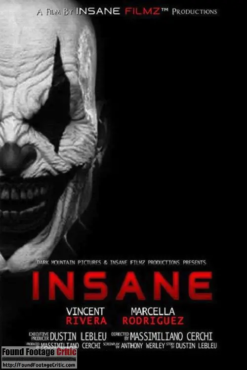
Regarding the graphology, of the poster, the general layout is effective and adheres to the horror film conventions. Firstly, the composition of the poster is effective. The most recognsable feature to notice is how only half of the clown face is present on the screen. This is a clever way to entice the audience into the film. This is because only being able to see half of a figures generates emotions and connotations of mystery and the unknown- features that are witnessed in horror films. This is included on the poster, as the audience may question as to why only half of the face is shown. The title of the film is placed in the centre, middle part of the poster. This is the strongest part of the poster, as the audience are going to be naturally drawn to the middle and the largest part of the poster. This is an idea that we will feature in our poster, as we feel that this convention is strong and a successful way to create a climax as well as involve our audience. 

   Secondly, the colour scheme used. The three colours used here are black, red and white. The white and the black completely juxtapose each other, creating strong, tonal contrasts on the page that help to fixate the audience. The majority of the poster is black, excluding the left hand side. The colour black connotes aspects such as: Power, death, mystery and murder, all of which are negative connotations that would be expected to be featured in a horror film/trailer. Furthermore, the colour black helps to create anticipation and a climax. This is because the colour black restricts many things from being seen, therefore creating an ominous and creepy atmosphere. The colour of the clown is white, with black markings on the mouth, nose and eyes. This is because the colouring of the poster has been changed to a monochromatic theme. This is effective, as it creates strong contrasts and tones that help to engage the audience, due to the boldness of the colours.  The last colour shown on the screen is red, which is used for the title and some of the small prints such as the actors names, and the production company. The colour red connotes danger and blood, again, aspects that would stereo typically be expected in a horror film. In addition, the colour red is bright and strong, the complete opposite to the other colours used on the poster so it helps to bring the composition of them forwards. This is an important factor, especially when considering the title as this is the main focus point in the screen. We have learnt to use this on our poster when we create ours, as is helps to make the audience aware of what the film is about.  The other parts that are shown in red is the word 'FILMZ' and the surnames of the actors/actresses featured in the film. This is effective, as a lot of the time, the surname is the most recognisable part of the actor. If a successful actor is featured in a film, then it helps the film to have a USP, which helps grossing film profits in the box office. 

Thursday 26 January 2017

Film Poster Inspiration

When creating our trailer, we also need to create a poster, As our film is a clown horror, we needed to take inspiration from other clown films, such as: IT, CLOWN, 100 TEARS and HELLO BINGO. All these titles had something in common and other aspects that made them all different. It was important for us to consider all of these ideas before creating our own. 
Image result for clown film posterImage result for clown film posterImage result for clown film posterImage result for clown film poster

All these clown posters have a common feature, regarding the shot of the poster. They all have a close up photograph of a clown against the screen. The clown is commonly looking directly at the audience, which gives an eerie and sinister appearance. In addition, it also helps to entice and invite the audience in, in a persuasive way as it almost looks like the clown is talking directly to the audience. This is effective because clowns are historically used to entertain and amuse young children, which means that they would be asking them questions, talking to them and playing games with them. Therefore, the idea of the clown staring directly into the audience's eyes helps to fixate and engage our target audience into the film. The colour scheme throughout the posters is commonly dark. The primary and main colours used are reds, blacks and whites which is ironic, as it is the colour of the face-paint that clowns would wear. These colours also symbolise negative aspects, for example, the colour red symbolised danger and blood, whereas black connotes power, mystery and death, all attributes that are commonly associated 
with horror films. 

In all three four of the posters, the title is placed at the bottom. This is effective, as the main image of the clown is filling the frame of the photograph, therefore, if the title was in the middle as well then it would create a distraction from the main image, which is the most important. The fonts are all in capital letters, which is not only a stereotypical convention for film poster, but helps to make the font bolder and more engaging for the audience. The audience are able to notice the title quickly, which immediately puts thoughts and ideas in their heads about what the film could potentially be about. Film posters are tricky, they need to be able to give the audience an insight to what the film is about, without giving too much away- much like a trailer. The posters need to be able to speak for themselves, which is an important factor that we have noted when we create our own poster.The credits and small prints are conventionally placed underneath the title of the film. This is an easy way for the audience to locate where the facts are about the film. Such as, who made the film, produced it and any actors/actresses that are featured in it, as well as the distributor. This is important, as it can help the film to have a USP- Unique Selling Point. If a film has famous and successful actors in it, that have been featured in other successful, popular and well known films, then its a common indication that this film will too, be effective and successful.

There are dark and reflective tones used on the posters which help to give an ominous and creepy atmosphere. Similar to our trailer credits, we want to include this on our poster. As the photographs are so close up, it's important to make the clown look realistic and effective. By adding small dash marks and faded corners helps to add a surreal and eerie atmosphere to the poster. The date is often placed where the credits are- underneath the main title. However, in the third film poster, the date is posted at the top. Identifiably, the date tells the audience the release date of the film. This is important for fans and movie enthusiasts, as it helps to create excitement and adrenaline for the audience. This is also an important factor regarding the social media aspects of the film, as then, the company are able to release hints and count downs for the film, to produce more excitement for the film, and get the film grossing and trending on sites such as Twitter and Facebook. 

Slogans are a common feature that are presented in posters. They help to entice the audience into the poster, usually through the way of asking questions- a form of direct address. Some examples of slogans in horror films include: 'If this movie doesn't make your skin crawl... it's on too tight!' This automatically suggests something about cannibalism as it creates an image of the skin needing to be removed due to it being to tight. This reflects a chilling atmosphere to the audience as the thought of someone saying that would unnerve anyone. This could suggest that the film is a zombie like one which answers why the skin is too tight as they eat skin.'The night HE came home' An enigma is created just by using the noun 'HE', as no one knows who this character is. Having it in capital upper case letter suggests that this character has dominance and power within the film, which you should not mess with. This therefore suggests that 'HE' is the antagonist of the film. Using the word 'home' implies that it would be set in a neighborhood which would be very relatable to the audience as they live in a neighbourhood.

Title Credits

For our trailer, we have to include our own title credits. When doing this, the font, style, colour, composition are all very important, especially when considering your genre. Our film is a clown horror, based around three girls and a creepy clown that follows the girls around. Therefore, our trailer titles needed tor resemble a horror film. 

The first title has a black background, with white writing. This immediately displays a good tonal contrast between the juxtaposing colours of black and white. This will help the audience to be attracted to the writing on the screen. The background slightly fades on the outer corners which gives the illusion of an eerie and creepy effect to it, which conforms to the horror genre. The font used here is called 'Arial Pressed VT'. This font is similar to fonts used on other production credits, and is usually a convention to have the font to be long and slightly over extended. In addition, the sub headings of 'Directed by' and 'Produced by' are usually a lot smaller than the name placed on the screen. This is because the credits care commonly placed at the end of the trailer. Many successful films usually have a USP ( Unique Selling Point), which is commonly the actors in the film.If a particular film has a well known and successful actor, then it usually gives the audience the impression that the film is going to be good. Thus, the titles on the credits usually have the name in bold. We used this convention in making our own. The title of our film is placed in the centre which is effective as it draws the audience's attention directly to it. In addition, the font is also larger of, 15 instead of 12 used for the smaller fonts. Our institution is placed in the middle on the top line. This is also effective, as a successful production company such as, Paramount or Universal produce successful films and are also well known and popular distributors. In our trailer 'Purple Lake Productions' is the first thing that is shown, this helps to give the audience the impression that our trailer is professional. Furthermore, we also have our second production company name on this trailer credit, of 'On Track Productions' adding in a second production company further highlight the professionalism of the trailer and gives the audience a slight inside into who made the film. 

However, we feel that this particular title doesn't display our genre effectively enough. We feel that this credit shows an action film more so than a horror. This is due to the type of font used and the basic layout and composition of the credit. Therefore, we will not be using the trailer credit in our film. 

This is our second trailer credit. Immediacy we were able to recognise that this trailer screams connotations of horror. This is due to the faded corners and the splattered marks on the page. The faded corners help to give an illusion of an eerie and sinister atmosphere. They almost look like ink markings which gives an old fashioned and archaic feel the the poster. The harsh and juxtaposing colours of black and white help to create strong tonal contrasts on the page, between the background and the font. Unlike the first trailer credit, the font here is black. The colour black connotes ideas of mystery, power and death which are all attributes/connotations that will be present in our trailer. The splatter marks on the page help to give a fun twist on the trailer credits. Our titles in the film are simply a black background against a white text, so having a few adjustments not only adds our own individuality and twist on our trailer, but makes it different compared to the titles which is imperative when trying to keep our audience engaged on the trailer. Our title of 'Joke's On You' is wrote in a different font compared to the standard text on the sides. This is effective, as it suggests that the title is the most important thing on the page, which also explains why it is in a larger font size of 15, rather than 12 like the rest of the text. The word 'joke' is seen to be funny and a laugh at someones expense. The fact that the title is placed in a different font could metaphorically suggest that the title is seen to be the joke on the page. Which is a clever and ironic way of looking at our title. Similarly to the last title, the names of the actors in the film are much larger than the sub-headings of 'Director' and 'Produced by'. This is because if a particular film has a well known and successful actor, then it usually gives the audience the impression that the film is going to be good. Thus, the titles on the credits usually have the name in bold and in a lager font. We feel whatever the appearance of our title, we should include both of our production companies which are- Purple Lake Productions and 'On Track Productions'. This cements the idea that our trailer is successful and professional. 

We will use the second trailer credits in our film as we feel that it conforms to the horror genre more successfully than the first credit does. The faded background and splatters on the page help to give an eerie effect as well as creating suspense to our audience. The font of our title is effective as it stands out from the rest, and has slightly curved letters which gives an old fashioned and archaic feel to the credits.

Monday 23 January 2017

Brief Analysis of our Trailer

       How have you encoded your trailer/opening 2 minutes in order to convey genre?
·         Our genre for our trailer is horror.  Stereotypical conventions concerning the category of horror in a trailer include: Sharp and edgy editing, isolated locations, music indicating a frightful moment coming up to create a climax/suspense and a disruption of normality. There are also subcategories of horror which include: Action Horror, Asian Horror, Clown Horror, Creepy Dolls and Toys and Dark Fantasy. Our film centres on a clown, which has a predominant creepy and ominous feel to it. Clowns are historically seen as entertaining and an amusing gesture for children at circus’s and fun fairs. To a more modern day approach, clowns are seen as creepy and disturbing. This could be due to the influence of films such as Stephen King’s “IT” and Tobe Hooper’s “The Poltergeist.” Regarding the editing in our trailer, we have used a lot of clever transitions to play on this idea of clowns being creepy and sinister.  There is a part in the trailer where the clown is shot three times, moving closer to the camera each time. We have used a ‘Non-additive dissolve’ to fade each clip of the clown together. This means that the second clip fades onto the screen with the previous shot still in the frame. This is an effective way to demonstrate the idea of the clown being supernatural and paranormal, as you cannot be in two places at once. Furthermore, the clown is tilting its head to the side in the first clip and not in the second, this depicts the idea of a glitch or a malfunction with the clown, giving the film a surreal and sinister atmosphere.


We used female actors as the protagonists in the trailer, as females are stereo typically seen as more vulnerable and innocent in comparison to males.  We showed match on action of the girls walking home from school, which can be seen through the MES of props, as they have folders and school bags. This conforms to the genre of horror. Horror films usually display a girl/s walking somewhere which helps the audience to feel suspense and uncertainty about what is going to happen next. We also display the girls in a home in the kitchen, which is a relatable and ordinary thing that teenage girls would do. Our target audience for our trailer is set at 15-25 year olds, which adheres to the fact that the audience can relate to the content shown, as being young teenagers/adults they are likely to do activities such as, relaxing at home, going to school/educational institute.

  
How have you subverted expectations in order to engage your audience?
Regarding the locations of where we have shot our trailer, we wanted the locations to be relatable, therefore making the audience feel part of the film and in the protagonist’s shoes. Stereo typically, horror films are shot in creepy, old houses or in the woods. With our trailer, we decided to include conventional locations to clearly signify to our audience what our genre is, but we also included locations that subvert to the horror expectations such as a park. Parks connote the idea of having fun, playing games and children enjoying themselves, we wanted to play on this idea, and make an amusing and pleasant location become completely juxtaposed to become a deathly and sinister location. We felt that this was ironic to the historical context behind clowns. Clowns were seen to be laughable figures for children, make jokes and entertain them- a similar purpose to a park. Thus, we put two and two together by linking to clown with a location.  Shots in the park include close up shots of a swing, swinging on its own to show a paranormal edge. A clown swinging on the swing after a shot of the swing on its own, to display to the audience that the clown can appear anywhere and anytime, generating emotions of fear.

Thursday 19 January 2017

INSTITUTION- Purple Lake Productions

This is our final institution we are using for our theatrical trailer. We decided to call it "Purple Lake" as we feel that this is a professional and yet simplistic name that makes our film look as if it would have been distributed by a successful company. We decided to incorporate a colour in our production title, in which we went with the colour purple. The colour purple connotes aspect such as: Mystery, poison, toxic, and power in which the majority of these are seen to be negative, which helps to link to the genre of our trailer. From research, lots of production companies use simplistic locations such as mountains or animals. Thus, we decided to use a lake for our production company. It was easy to find a photograph of a lake off the internet in which we then edited on Photoshop. Photoshop is a complex platform, which allowed us to manipulate many different parts of the photograph. The first thing that we did, was edit the brightness and contrast of the photograph. We made the brightness +11, and the contrast -46. These particular scales ensure that the photograph had darker edges, and a brighter centre. This gave the illusion that it had a  'Vignette'  effect to it. this particular filter, creates a eerie daunting atmosphere due to the black shadows created in the background. This makes the institution effective, especially for a film with the genre of horror.We also decided to use the Hue and Saturation tool to edit the colouring of the photograph. As our company features the colour purple in the title, we decided to include this into our photograph as well. We made the hue +3. This particular scale made the image have a purple tone/shade to it, which not only created strong tonal contrasts, but it also helped to balance out the photograph with the title of the trailer. 

When creating this on Adobe Premier Elements 10, we had to use transitions and filters to ensure that it looked as professional as possible. We pasted the photograph onto a plain black background, which we had saved as a JPEG on paint. We then pressed CTRL T to adjust the height and width of the photograph against our screen. This was very important, as we wanted to ensure that it wasn't too big that it was overbearing for our audience, but not too small so that it appeared insignificant. We then added a colour switch effect to it. This meant that we turned the photograph black and white, and then the filter then changed it back to colour. This was effective, as it made the institution look professional. Most production companies have simple yet appear to be complex transitions to them, such as a change in shape or font, we decided to change the formal element of colour instead to add our own individuality. Furthermore, we used a dip to white transition to flow the two clips together with the rest of our trailer. We decided to use a dip to white instead of black as we feel that the dip to black would become too repeatative when creating a horror film. The white flash also added a sophisticated atmosphere to our title. 


Font Research for Poster

The font and style of our title is essential when creating a poster. It gives the audience an idea into the genre of the film and the kind of content that would be used. For example, you wouldn't have a bloody font for a romantic comedy film would you? We did some research into the particular styles of font, to ensure that we are all happy with the end result. 

This font is very effective as it creates a eerie like atmosphere of which is due to the bulb like ends of the font. This font also gives us two options; either regular or bold, which are the important types of formats as one can be used to attract the audience and the other would give more information about it. The font is simplistic but still maintains a professional feel to it. We feel that the bold font looks most effective as it helps to engage the audience as much as possible, simply because it is bolder to them on the page. 

These fonts are have more of a intricate design with complex patterns added on to the font. In my opinion, if this went onto our magazine, it would make it tacky and come across childish. This would mean completely missing who our target audience, meaning no one would buy the magazine due to contradicting images; having a horrifying image form our horror film, with tacky childish typefaces. Due to the tackiness and designs of cobwebs on these fonts, it would make our film magazine cover child-like and therefore not professional looking or effective.


 This font only has one type of format which doesn't give us much options, which is required due to the different features which on consist on magazine; puffs, anchorage text, sell lines etc. Although it does not give any options it is easy to read as the letters are spaced out evenly therefore clear. Again, this font is particularly simple, which helps to conform to the conventions of poster's surrounding our genre. However, I do feel that this font is almost too simple, that it wouldn't look like it was hinting at the idea of a scary clown horror film.

This font, as you can see, is called 'Rosario' and it comes in four different formats. This gives us a variety of choice on which format to use for different features of the magazine, for example 'Rosario Italic' could be used for the anchorage text to display information, whereas the 'Rosario Bold' could be used for the sell lines of the magazine as the are bold therefore stand out form the magazine cover more. This font is also very simple and easy to read, which is a key feature as we want the audience can read it from
various distances. Due to the simplicity of the font, it would be associated with a range of film genres which could be.


 'Blockhead Regular' gives has three different formats; regular, bold and fat. This, again, gives us an option of which ones to use. However, easy to read up close, if the magazine was on the shelf, it would be rather hard to read therefore not effective or efficient to use for a magazine cover. The rounded edges and techno like design of the font connotes to sci fi like atmosphere, of which we would prefer to have a eerie/ horror sense due to the magazine main image being our horror film, 'Betrayal'.present with on the cover.

Creating Our Magazine!

For our exam, we also have to create a Magazine Covers. Popular film magazine covers include Empire, Scream and Entertainment. A film magazine gives an overview of an upcoming films. They include photographs, actors interviews, facts, behind the scenes photographs and games and quizzes... The best present for a fanatic film lover.  

We took a lot of inspiration from the film company "EMPIRE". Empire is a British film magazine published monthly by Bauer Consumer Media of Hamburg based Bauer Media Group. From the first issue in July 1989, the magazine was edited by Barry McIlheney and published by EmapBauer purchased Emap Consumer Media in early 2008. It is the biggest selling film magazine in the United Kingdom and is also published in the United StatesAustraliaTurkeyRussiaItaly and Portugal. Empire organises the annual Empire Awards which were sponsored by Sony Ericsson, and from 2009 sponsored by Jameson.The awards are voted for by readers of the magazine.

The main aspect to our film that we wanted was for it to be unique. We wanted to take tips and advice from other covers, to help give a well constructed cover, but ultimately we wanted to add our own individuality to our trailer. Therefore,we decided to call our magazine "DIVERSE". Diverse means "showing a great deal of variety; very different." so this was a perfect name to call our film. The word is strong and snappy which adheres to conventions of film magazines. The word also suggests that there will be other genre's inside the magazine,which shows that we have acquired to everyone's taste, so if you're not a gigantic horror enthusiast, there is something inside there for you. 

Regarding the style of the title, we wanted to keep it as simplistic as possible, as we feel that this way, it adds a more professional approach. We decided to use capital letters for our title, as this makes it appear as bold and simple as possible. In addition, it also displays a link to "EMPIRE'S" magazine as they too, used capital letters. We want to keep the title in the centre of the page, as this is the most common convention.However, it also makes the audience's eye's be directly drawn to the page as it displays the most dominating part of the whole front cover.  We decided to keep the font colour black. Black not only adds a professional and effective colour to the title,but black also connotes negative aspects such as, mystery, evil and power which are all connotations that are found in horror films. 

For the background of our magazine, we used our own photography. As our film is based around a clown, we wanted to include the clown on our front cover.  The clown is placed in a powerful and authoritative position, with it's head tilted towards the left hand side. This gives a creepy and ominous appearance, as it gives the effect that the clown is looking directly at you/our audience. This particular shot was taken in the street, which is an everyday location that the general public are familiar with. Therefore, it creates this idea of reality, which would make our audience more on edge.  The clown is standing underneath a lamp post, which is the only bit of light that is on the page. The photograph was taken in the dark, which adds a strong contrast to the photograph. 


We used Photoshop to edit the font of our film. Photoshop is a complex software, which allowed us to play with colours, tones and saturation's. We used the "brightness and contrast" button to edit the font. This helped to make our font look more luminous so that it would stand our to our audience well. By using photoshop we were able to remove writing on the balloon from the original photograph by using the 'Clone Stamp'. The balloon had 'BEWARE' written on it and was also green, which didn't fit with our colour scheme well. In addition, we felt it made the cover look inappropriate and foolish.

Friday 13 January 2017

Research and Planning

An exception effort from you - with thorough analysis and condersation.  Add some screengrabs to early analysis and guide your reader through your posts - for example, by commenting on the strengths of your storyboard as a basis for initial ideas.