Friday, 24 February 2017

EVALUATION ONE: Have you subverted or conformed to stereotypes typical of your genre?

For our trailer, our chosen genre was horror. Horror films are rated to be the third most watched films in the world, with action and adventure first, followed by comedy second. Through numerous research we were able to find and learn about specific conventions and stereotypes relating to the four key areas of, MES, Sound, Editing and Camera to what makes a successful horror trailer. Some examples included, quick and fast paced editing so that the audience are left feeling confused and puzzled, which generates the emotion of mystery, which keeps the audience engaged and fixated. Dark clothing to be worn by the antagonist to emphasise a hidden identity, which further adds mystery  to entice our audience. We used binary oppositions in our trailer between 'good' and 'evil' between the hugely  terrifying clown and the three innocent,vulnerable girls. This is a stereotypical convention used in horror films to help set the scene.

We conformed and subverted to the stereotypes of a horror in our trailer.

Sound was a key area of where conventional expectations were met and conformed to. Adding sound was the final step to making our trailer, so we had ensure that all the footage and editing was complete before pasting in any sound, as this would jumble up our timeline and move everything around. Sound in horror films is a primary element to what makes the audience feel scared. Without sound, the audience would not feel as on edge or tense, so it was imperative that we one, had appropriate music and two, was fitted into the correct area. We used a mixture of diegetic and non-diegetic sound to make our trailer seem as realistic as possible. In the opening to our trailer, there is an eerie thud sound, as our institutions are introduced. This thud conforms to a horror trailer, it sets the mood that this is not a positive or optimistic location. Films such as Sinister, The conjuring and Insidious all feature this particular sound effect, which are all successful, box office hits under the horror title. The opening, establishing shot opens with diegetic sound of a radio playing jazz music. Initially, this would be seen to subvert to a horror trailer, as jazz is seen to be joyful and happy music, and horror films are the stark opposite of that. However, modern day horror films play on the idea of ordinary things, to make audience feel enticed as things almost seem 'too normal' before what Todorov's would call a 'disruption of the equilibrium', whereby an action causes a dip in the trailer, changing the initial narrative of the film. We also used sound effects in our trailer, which also conformed to the stereotypes of a horror film. We used a heartbeat sound towards the end of the trailer, to build up tension. Building tension towards the end is an effective way to make the audience go and see the film. The heart beat connotes to the idea that someone is feeling anxious, the heartbeat is fairly quick which accentuates the idea that someone is feeling scared- a common attribute and emotion that is expressed in horror films. Films such as 'IT' and ' The Shining' have used the heartbeat sound effect, which were also very successful horror films.

Costume also displayed a key attribute in our trailer. As we did a clown horror, we had to almost subvert and steer away from the typical soul destroying and blood thirsty demons hunting and possessing innocent people, but rather, look at a clown and how we can get the clown to be perceived as 'scary'. We took a lot of inspiration from the 1986 classic, 'IT' by Stephen King. This displayed a clown in a full on clown outfit, however we subverted from this idea, primarily because it was expensive to buy the full outfit and was too hard finding a place to buy it. Therefore, we had to come up with a way in which we could still make a clown look like a clown and be terrifying. We brought  mask from a store, which was slightly over sized, which conformed to a horror as it almost showed the idea of dehumanization, and also had stereotypical conventions of a clown appearance, such as, a red nose, white skin and extended smile. We then dressed our antagonist in black clothing, as this connotes to power, mystery and darkness which all conform to a horror film. The girls were dressed in simplistic clothing, such as jeans and t.shirts, basic clothing that teenage girls would wear. The effect of this meant that the girls appeared relatable and vulnerable, which helped to prey on the personas of the three girls, displaying them as innocent and helpless, which also conforms to horror films of having a innocent girl, such The Orphan and Would you Rather.

Editing was a way where we could play around and experiment to create tension and fear for our audience. We used a non additive dissolve numerous times in the trailer, to add a creepy and paranormal atmosphere. This can be displayed in the scene with the clown on the swing. As the swing is swinging back and forth, we faded in a non additive dissolve to merge two clips over the top of one and other.  This conformed to a horror film as the effect made the clown appear like it could be in two places at once, something that is not considered 'normal' in the human world, suggesting a paranormal and scary vibe being created. We used fast paced editing towards the end of the trailer, which conforms to a horror film as fast editing generates confusion, so this not only makes our audience want to see our film so they can discover what will happen, but also creates tension and fear of when the fast building of editing is going to end.

There were aspects in our trailer that were subverted to, and this came down to a particular location used in the trailer. We used a park as a scene where the clown is displayed swinging on a swing slowly, and then cutting to a scene where the clown is no longer shown. This created the paranormal vibe that we waned, but the general location of the park i feel subverts to a horror film. Parks are primarily made as an entertainment factor for young kids to run around, have fun and enjoy themselves, so why include this in a horror trailer? We figured that because clowns are historically associated with children, as they were seen to tell jokes and give balloons out to them, we wanted to put the clown in a location where children would go. We almost put two and two together, and put completely juxtaposing things together to create an uneasy atmosphere. Although a park subverts to a horror film, we made it work seeing a we were filming at night and there was nobody else in the shot.

Tuesday, 7 February 2017

Analysis of our Magazine Cover

This is a photograph of our magazine front cover. We took a lot of inspiration from the international film magazine- 'EMPIRE', as it had a lot of conventions that we feel fitted well to our magazine. For example, having a bold title and subtext on the sides of the poster. The cover presents the clown in the centre of the page, creating a dominating composition against the background of the image. We decided to use a long shot of the clown for the front cover of our magazine. This was because it helped to demonstrate to the audience the clowns body language, in which the clown is holding the prop of a balloon and stood as if its frozen in a particular frame. This gives the illusion of dehumanisation, as it appears like the clown is paranormal due to its posture, which successfully conforms to the conventions of a horror protagonist. We used the prop of a balloon on the cover, as we feel that this is a stereotypical convention that clowns have attached to them- usually to give out to young children to entertain them. We felt that this would be a successful idea to bring into the magazine. The MES of the costume can be considered here, with the colour of the clothing. The clown is wearing an all black outfit, which is a stereotypical convention of a protagonist from a horror film, as it almost blocks our any reconciliation of their identity. In the film industry, protagonists are usually not identified until the end, so the blocking out of their identity cements the idea of mystery, an aspect that is very common in horror films, because of the 'fear of the unknown'. In addition, the colour black connotes ideas of power and death, which are other aspects that are predominant in horror films. 

We used a bold title at the top, centre of the page. This makes the title appear dominating, and gives the poster an authoritative composition. Film magazine covers, usually have the title of the magazine in this location, as it helps to make it easy to locate on a magazine shelf. Makers want audiences to buy their magazine, so why not make it bold and eccentric? We decided to name our poster 'Diverse' Diverse means "showing a great deal of variety; very different."- Google Definitions. So this seemed like a good name to call our magazine cover, as it adds our own twist and individuality to the magazine. The font we chose was bold and had extended lines on the curves of the letters, adding an archaic and old fashioned feel to the writing, which contrasts with the historical conventions connected to the clown of being seen as symbol of entertainment. At the bottom of the page, we incorporated the title of our film 'Joke's On You'. This is an important convention to include, as film makers want the title of the film to be spread and talked about, especially on huge platforms such as social media, whereby fan accounts and hashtags get the word spreading. This helps to get the film grossing, the more people talking about it, the more people will want to see the film/watch the trailer. Therefore, we decided to make the font big, and the same font that is at the end of our trailer. The font is almost child-like and has a fun twist on it, which helps to play on the idea of the clown being a symbol for children. Again, we used the letter 'O' in the word 'Joke's' to be replaced with a balloon as we feel that this is a fun twist to add, as it helps to add the idea of the clown back into the poster. We also included a bar code on the bottom right hand corner of the magazine. All magazines have a bar code, and we wanted our magazine to look as realistic and professional as possible. We didn't want it to be too recognisable, as we feel that it is not that significant and important to have on the page.  The colour scheme on the poster is monochromatic. We feel that this added strong, tonal contrasts to the poster that would help to differentiate it, if it were on a shelf with other magazines. Furthermore, the idea of 'black against white' could be seen in a metaphorical sense as 'good vs evil' which is the predominant aspect that is demonstrated in horror films. We included subtext o the sides of our magazine as this is a convention that is used on posters to add extra information of what is inside the magazine. For example, we used subtext reading 'The recent remake of the 1990 hit' which is an effective way to invite audiences as this points and implies at Stephen King's 'IT' which was very successful in the film industry, therefore making audiences want to watch our film. 

PURPLE LAKE PRODUCTIONS BRINGS YOU: Our Magazine


Monday, 30 January 2017

Main Film Poster Inspiration

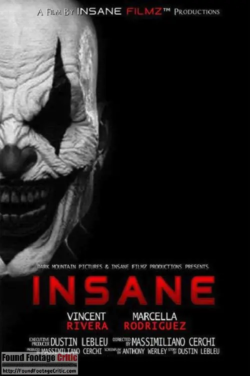
Image result for clown film posterFor our film poster we took our main inspiration from the film 'INSANE'. This particular poster had many features that made us take a lot of inspiration and ideas. The genre of this film is the same as our trailer ( a clown horror ) therefore, the poster had a lot of stereotypical conventions linking to this particular genre. The film poster is very similar to the trailer in a way. In the sense that, the film poster and the trailer need to give the audience an idea to what the film is about, without giving too much away. We want to engage our audience and entice them into the idea of the clown, but at the same time, not release too much information so that the plot and basic narrative of the film is given away. 

Regarding the graphology, of the poster, the general layout is effective and adheres to the horror film conventions. Firstly, the composition of the poster is effective. The most recognsable feature to notice is how only half of the clown face is present on the screen. This is a clever way to entice the audience into the film. This is because only being able to see half of a figures generates emotions and connotations of mystery and the unknown- features that are witnessed in horror films. This is included on the poster, as the audience may question as to why only half of the face is shown. The title of the film is placed in the centre, middle part of the poster. This is the strongest part of the poster, as the audience are going to be naturally drawn to the middle and the largest part of the poster. This is an idea that we will feature in our poster, as we feel that this convention is strong and a successful way to create a climax as well as involve our audience. 

   Secondly, the colour scheme used. The three colours used here are black, red and white. The white and the black completely juxtapose each other, creating strong, tonal contrasts on the page that help to fixate the audience. The majority of the poster is black, excluding the left hand side. The colour black connotes aspects such as: Power, death, mystery and murder, all of which are negative connotations that would be expected to be featured in a horror film/trailer. Furthermore, the colour black helps to create anticipation and a climax. This is because the colour black restricts many things from being seen, therefore creating an ominous and creepy atmosphere. The colour of the clown is white, with black markings on the mouth, nose and eyes. This is because the colouring of the poster has been changed to a monochromatic theme. This is effective, as it creates strong contrasts and tones that help to engage the audience, due to the boldness of the colours.  The last colour shown on the screen is red, which is used for the title and some of the small prints such as the actors names, and the production company. The colour red connotes danger and blood, again, aspects that would stereo typically be expected in a horror film. In addition, the colour red is bright and strong, the complete opposite to the other colours used on the poster so it helps to bring the composition of them forwards. This is an important factor, especially when considering the title as this is the main focus point in the screen. We have learnt to use this on our poster when we create ours, as is helps to make the audience aware of what the film is about.  The other parts that are shown in red is the word 'FILMZ' and the surnames of the actors/actresses featured in the film. This is effective, as a lot of the time, the surname is the most recognisable part of the actor. If a successful actor is featured in a film, then it helps the film to have a USP, which helps grossing film profits in the box office. 

Thursday, 26 January 2017

Film Poster Inspiration

When creating our trailer, we also need to create a poster, As our film is a clown horror, we needed to take inspiration from other clown films, such as: IT, CLOWN, 100 TEARS and HELLO BINGO. All these titles had something in common and other aspects that made them all different. It was important for us to consider all of these ideas before creating our own. 
Image result for clown film posterImage result for clown film posterImage result for clown film posterImage result for clown film poster

All these clown posters have a common feature, regarding the shot of the poster. They all have a close up photograph of a clown against the screen. The clown is commonly looking directly at the audience, which gives an eerie and sinister appearance. In addition, it also helps to entice and invite the audience in, in a persuasive way as it almost looks like the clown is talking directly to the audience. This is effective because clowns are historically used to entertain and amuse young children, which means that they would be asking them questions, talking to them and playing games with them. Therefore, the idea of the clown staring directly into the audience's eyes helps to fixate and engage our target audience into the film. The colour scheme throughout the posters is commonly dark. The primary and main colours used are reds, blacks and whites which is ironic, as it is the colour of the face-paint that clowns would wear. These colours also symbolise negative aspects, for example, the colour red symbolised danger and blood, whereas black connotes power, mystery and death, all attributes that are commonly associated 
with horror films. 

In all three four of the posters, the title is placed at the bottom. This is effective, as the main image of the clown is filling the frame of the photograph, therefore, if the title was in the middle as well then it would create a distraction from the main image, which is the most important. The fonts are all in capital letters, which is not only a stereotypical convention for film poster, but helps to make the font bolder and more engaging for the audience. The audience are able to notice the title quickly, which immediately puts thoughts and ideas in their heads about what the film could potentially be about. Film posters are tricky, they need to be able to give the audience an insight to what the film is about, without giving too much away- much like a trailer. The posters need to be able to speak for themselves, which is an important factor that we have noted when we create our own poster.The credits and small prints are conventionally placed underneath the title of the film. This is an easy way for the audience to locate where the facts are about the film. Such as, who made the film, produced it and any actors/actresses that are featured in it, as well as the distributor. This is important, as it can help the film to have a USP- Unique Selling Point. If a film has famous and successful actors in it, that have been featured in other successful, popular and well known films, then its a common indication that this film will too, be effective and successful.

There are dark and reflective tones used on the posters which help to give an ominous and creepy atmosphere. Similar to our trailer credits, we want to include this on our poster. As the photographs are so close up, it's important to make the clown look realistic and effective. By adding small dash marks and faded corners helps to add a surreal and eerie atmosphere to the poster. The date is often placed where the credits are- underneath the main title. However, in the third film poster, the date is posted at the top. Identifiably, the date tells the audience the release date of the film. This is important for fans and movie enthusiasts, as it helps to create excitement and adrenaline for the audience. This is also an important factor regarding the social media aspects of the film, as then, the company are able to release hints and count downs for the film, to produce more excitement for the film, and get the film grossing and trending on sites such as Twitter and Facebook. 

Slogans are a common feature that are presented in posters. They help to entice the audience into the poster, usually through the way of asking questions- a form of direct address. Some examples of slogans in horror films include: 'If this movie doesn't make your skin crawl... it's on too tight!' This automatically suggests something about cannibalism as it creates an image of the skin needing to be removed due to it being to tight. This reflects a chilling atmosphere to the audience as the thought of someone saying that would unnerve anyone. This could suggest that the film is a zombie like one which answers why the skin is too tight as they eat skin.'The night HE came home' An enigma is created just by using the noun 'HE', as no one knows who this character is. Having it in capital upper case letter suggests that this character has dominance and power within the film, which you should not mess with. This therefore suggests that 'HE' is the antagonist of the film. Using the word 'home' implies that it would be set in a neighborhood which would be very relatable to the audience as they live in a neighbourhood.